http://www.youtube.com/watch?v=8MCDAYeaZ_c&feature=player_embedded
I totally featured FFXIII-2 a few Sundays ago, but I've been totally diggin' this song lately, so here it is. It's by Origa, the same woman who did the Ghost In The Shell Stand Alone Complex songs (sung jointly in English, Russian, and Japanese, all by here? Impressive). But seriously, the FFXIII-2 soundtrack is great.
Hey there! I'm here today with a lesson. If you didn't know this about me, I'm a pixel artist. I've posted shamefully little pixel art on this blog, in no small part because I've more or less not made any original pieces in a while. However, I'm not absent in the scene - I've simply redirected myself. See, I consider myself decently knowledgeable about the aesthetics of pixel art. I'm no pro, and I defer to the know-how of the geniuses of the community (I'm thinking specifically of Helm, cure, jalonso, mrmo tarius, Jinn, and ptoing - there's waves more, but those are the idols who come to mind), but one thing I do that's a little different is that I'm a very thorough person, not in art, but in critique. I will write thousands upon thousands of words of critique for pieces, and my style of writing has evolved over time to try to be as clear and informative and supportive as I can be while still providing a lot of helpful information.
In the process of doing so for a bunch of people (particularly Izzy aka OCEANSCENTED - we'll see her work several times in future posts), I've covered quite the wide range of topics. From pillow shading to black outlines to color glare and saturation balance to refined lines, I've thought about quite the variety of concepts in pixel art and talked about many of them. For someone without really any formal training in art, just (at this point) 8 years of pixel art experience, I think I've gotten pretty good.
Why share with you guys though? Because a) I work hard on these but neither dA nor PJ have great ways to find past comments so I lose some of the old lessons I did, and I can immortalize them here, and b) turns out you don't need to be the target of a critique to learn stuff! I honestly think they're pretty informative even
Let's real quick take a look at my history. If I'm to talk at length in a teaching capacity, I feel it important to establish my ow credentials. I've been actively making pixel art since early 2005. I got into the hobby through the long-dead Nsider forums (the official Nintendo forums back in the day), participating in a Fire Emblem sprite thread. I began as many did, with recolors and later edits (though I must say I'm now of the mind that starting with recolors or edits are a poor way to start out). In the course of that, I joined a Zelda forum The Forest Haven (also now defunct) where I became a regular pixel art poster. Soon after, I began my custom sprite work, working from 100% scratch. It didn't take long after that for me to leave edits behind and stick solely to custom work (sort of! You'll see what I mean...), and I joined the forum attached to The Spriter's Resource, Pixeltendo (also now defunct). That was a juggernaut of a forum - everyone was a huge asshole to newbies, but through lurking and dedication I was able to really develop. I majorly credit SmithyGCN, Shawn, 1up, OMGFossil, Badassbill, and Tonberry2k for being the pixel artist I am today. I began giving serious constructive criticism posts, and through those rare times when I'd actually post, I stacked up a little bit of reputation there for that (showing up at tSRC years later, that's what I was mostly remembered for).
Eventually I found Pixelation and Pixeljoint, and joined deviantArt. While dA has a shitty support structure for Pixel Artists and is dominated by amateurs and dollers, I'm still occasionally active there, helping people out (mostly Izzy I guess). I'm most active on PixelJoint, where I go by Ego, and you can find me there quite easily, and I've received a moderator commendation for constructive criticism excellence (thanks jal!). I'm not active on Pixelation. On the whole, Pixelation has more than enough champions, and is the only major community that I consider to still be way out of my league.
So that's me! In the past while I've started making explanatory pictures to try and add a visual element to my walls of text. They won't always be there, but the most recent ones I've done will have some.
Enough of an intro though, let's begin!

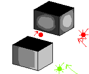
 What that image shows is two things. First, with my point about
lightsources, you may argue "But I have a lightsource - see, the front
is lighter than the side, it's comign from the front!" and you'd be
right-ish. As I point out in that picture, the green arrow shows your
overall light direction. This is a good idea! The general concept is
okay. However, the red arrows are your true light sources. If you look
at the front, each stone actually has its own individual light source
coming from dead in front of it, rather than all coming from a single
point. And from the side, yes, it's darker, but the highlight is still
right in the middle, rather than the shading itself following the light.
Link:
What that image shows is two things. First, with my point about
lightsources, you may argue "But I have a lightsource - see, the front
is lighter than the side, it's comign from the front!" and you'd be
right-ish. As I point out in that picture, the green arrow shows your
overall light direction. This is a good idea! The general concept is
okay. However, the red arrows are your true light sources. If you look
at the front, each stone actually has its own individual light source
coming from dead in front of it, rather than all coming from a single
point. And from the side, yes, it's darker, but the highlight is still
right in the middle, rather than the shading itself following the light.
Link:
 In this image, you can see how a lightsource would hit an individual
block. Here:
In this image, you can see how a lightsource would hit an individual
block. Here:
 This image is more representative of how it changes as you get further
along (though this is unshaped and quickly made). By the way, the tops
of the blocks are black because they are irrelevant to this example, not
because of any effect of the lightsource.
This image is more representative of how it changes as you get further
along (though this is unshaped and quickly made). By the way, the tops
of the blocks are black because they are irrelevant to this example, not
because of any effect of the lightsource.
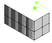
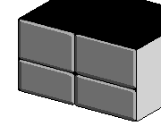
The other aspect of the problem of pillow shading here, is the shape of a block. Let me pose to you a really obvious rhetorical question: what shape is a brick? It's a rectangular prism, right? Flat sides? Yeah, of course. The problem with that is that that's not what you drew. See, you have each block having this round-ish highlight in the middle and a shadow in a ring around the edge. This is the hallmark of a round shape, of a sphere. Here's an image:
 It should be pretty obvious that the bottom block is more representative
of a block. Let's see how the light hits the house front real quick:
It should be pretty obvious that the bottom block is more representative
of a block. Let's see how the light hits the house front real quick:
 Okay, let's now see how it would look if you used blocks.
 There. Now, that really displays what the lightsource is on the blocks.
Now, that's a really obvious concept. I can't imagine you didn't understand that blocks are flat and that light comes from one place. So why did you shade like you did? My guess: that last image? Borrring! It's flat and without texture and interest. I entirely agree with that. However, in adding that shading, you changed the shape of things, and that's not good. See, texture should conform to the object, not change it. That can be hard to do with flat surfaces without leaving them boring. Let's see if we can't come up with some ideas to spice things up.
 That's the basic image of a couple of bricks stacked on each other, with
no sort of shading or texture - that's the baseline I'm gonna example
with. Entirely ignore the other sides right now, they don't matter. Now,
to be entirely honest, it still doesn't quite look like stacked blocks,
it looks like a flat wall with black lines painted on it. What's
missing is a way to distinguish that there's a bit of a gap between
blocks, to give them each some dimensionality. As we've discussed,
highlighting the center isn't the way to do it, since that alters the 3d
shape of the block into a spherical form.
That's the basic image of a couple of bricks stacked on each other, with
no sort of shading or texture - that's the baseline I'm gonna example
with. Entirely ignore the other sides right now, they don't matter. Now,
to be entirely honest, it still doesn't quite look like stacked blocks,
it looks like a flat wall with black lines painted on it. What's
missing is a way to distinguish that there's a bit of a gap between
blocks, to give them each some dimensionality. As we've discussed,
highlighting the center isn't the way to do it, since that alters the 3d
shape of the block into a spherical form.
Instead, think about the shape. A good way to make it work can be to round off the sharp corners a bit - make it seem like things don't fit together seamlessly. Another is the push out the center a bit. This is done by giving the block visible edges, in that some bits along light-touched sides will get highlights while the opposite ones will be in shadow. This is hard to explain, so here's an image:
 In this picture, you can see how the placement of shadows and highlights
gives the entire center of the block a raised appearance, or, more
accurately, it gives the other parts a sunken look. In general though,
it still gets to look squareish and shaped right, but it's definitely
not quite as boring as before. As you move along a side you can play
around a bit and make things more shadowed or highlit, and it's
important to always remember where your lightsource is - in this case,
that means that for some of the blocks you'll add even more shadow that
is caused by the overhang of the roof casting shade. For example, these
blocks wouldn't get touched by nearly as much light as some of the
others:
In this picture, you can see how the placement of shadows and highlights
gives the entire center of the block a raised appearance, or, more
accurately, it gives the other parts a sunken look. In general though,
it still gets to look squareish and shaped right, but it's definitely
not quite as boring as before. As you move along a side you can play
around a bit and make things more shadowed or highlit, and it's
important to always remember where your lightsource is - in this case,
that means that for some of the blocks you'll add even more shadow that
is caused by the overhang of the roof casting shade. For example, these
blocks wouldn't get touched by nearly as much light as some of the
others:
 There are other things you can do to add texture and interest. Divots
and chunks taken out of a couple of blocks, cracks at the edges of some
maybe, perhaps even a rough dither texture at the fading edges to imply
roughness, you have options. The trick is to use them sparingly - above
all else, it's important that the idea of "block" be communicated.
There are other things you can do to add texture and interest. Divots
and chunks taken out of a couple of blocks, cracks at the edges of some
maybe, perhaps even a rough dither texture at the fading edges to imply
roughness, you have options. The trick is to use them sparingly - above
all else, it's important that the idea of "block" be communicated.
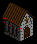
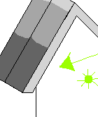
The roof is pillow shaded as well, up to a point. First off, it's not precisely clear what it's supposed to look like. From my looking at it, it appears like corrugated metal - not that bad, considering people actually make roofs out of that, although I don't think monk abbeys get that sort of roof. There's no real shaping to anything. To be brutally honest, it looks like a bunch of tubes with the light source positioned directly in front of each of them. It also hurts that they don't have any 3d sculpting to them - there's no clear differentiation between the side and the top, which there would be on the closest one, and we should see some kind of bottom side as well. While the light source is stronger the further to the bottom right you get, each of them has the exact same amounts of shadow all the time in the same places. I'm pretty sure you copy/pasted them and then added the highlights on top of that.
Uniformity, Banding: The next lesson here is about uniformity and banding. Banding is a sneaky problem that emerges when you have lines or clusters of pixels "hug" each other to try and create shading. Really though, it gives this blurry, unsettling appearance - the technical terminology is that it lowers the resolution since you can use it to easily identify the size of a single pixel, but that's a whole complicated subject. Basically, the idea is "don't do it." The most common occurrence is when you shade by tracing around the inside edge of something. Your piece is FULL of it. Let's point out some of the examples, though I'm going to ignore the BIG one for a moment.
In each of those loops you will find examples of shades hugging other lines exactly. That's not all of it though - your piece is positively covered in banding. However, like I said, I'm ignoring the big one.
The Roof:
This is a solid block of banding. Single, identical lines of slightly different color, one after the other, "recreating" a blurry gradient effect without modeling anything real. Repeating and mirroring just made it worse. It's a highly aesthetically unappealing technique, and should be avoided at all costs. The best I can say for the roof right now, really, is redo it. Redraw it entirely, keeping in mind the ideas of shape and lightsource. There's a lot of problems with the piece, but the roof is the only thing I think is completely unsalvageable in its current state.
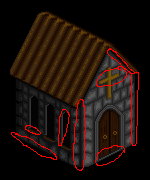
 Let's hit each point. A: The trouble at A is that the block isn't
square. This block, for whatever reason, jsut keeps on stretching on so
it can hit the door frame, which doesn't make a lot of sense.
Let's hit each point. A: The trouble at A is that the block isn't
square. This block, for whatever reason, jsut keeps on stretching on so
it can hit the door frame, which doesn't make a lot of sense.
B: The size of the blocks doesn't line up. Did the builders just haphazardly decide that some blocks would be short and others long? They should be the same, or at least have some reason to why the size shifts.
C: Two things. First, the angle of the block seams don't make sense for the plane they're on. On the front, while most blocks have a "/" direction, the blocks next to the corner have seam slopes like this: "\". There's no reason for that. Second, technically, these two that I'm indicating are the same block. Right? They're cornerstones. Their seams should meet, and the slopes should flip at the corner. Which brings me to my next point:
D: There IS no corner. This building has a corner line most of the way down, is shaded like a corner, has at least two other ground-touching sharp corners, but this corner at point D is at a different angle. It doesn't really make any sense at all. Think about how it would function, maybe look at some other isometric houses to understand what it would look like. Heck, the house, ultimately, is a block with a triangular prism on top and a couple window/door holes carved out of it - just look at my blocks above and see how they show their corners.
E: Uniformity in shading. The shading should be rational and sensible, following the lightsource, but this one seems to just be gibberish - you put a banding shadow around the seams and tossed in a center highlight. Most of them are like this, I'm just only calling you on one.
Uniformity can be hard, but having a unified-looking image where everything plays by the same lightsource(s), shapes make logical sense, and objects act as they should, go a long way to making a strong piece. Remember that too much uniformity can be boring though, that making things uniform through banding is actually problematic, and that being uniform in shape still demands adherence to your lightsource.
Almost done. I got one more thing to talk about: colors. First off, I have no idea where you're getting 24 colors from - technically, you have 59 colors in there. A lot of those are clones though, goof colors that are usually an indication that you've either a) been messing with transparency, b) been using automatic tools like blur or an anti-aliased brush, or c) you saved it in a bad format at some point (it's not that one, unless you did some extreme clean-up work). I'm guessing it's the first one - you've done transparency stuff before (your Golem Foundry piece has 143 colors from it). Here's your color goofs:
 44, most of which are only present for single pixels.
The real tragedy though is that you don't even need those 15 colors. I think this could be pulled off without too much trouble using, I dunno, 8? Maybe 9? Here's it in a hyper-simple form with 6 colors where I just consolidated similar colors.

And again, I worry that this looks like I'm picking on. I swear I'm not
trying to. This is for your benefit, I'm just hoping to help you out.
And please, if it does help, or if you have further questions on
something (maybe something I didn't explain well enough), ask away, I'd
love to field them.
For additional reading, the best two tutorials I've seen out there:
The Pixeljoint Tutorial (http://www.pixeljoint.com/forum/forum_posts.asp?TID=11299)
The Pixelation Tutorial (http://www.pixel.schlet.net/)
Cheers, happy pixelling!

That said, it isn't perfect. None of the things I have to say today are on anywhere near the scale of the issues in the previous post - if I saw that image in an indie game, I would be all right with seeing it. Still, some things could use some fixing, so if you don't mind me rambling on a little longer, I'd like to address them. Unfortunately, this barely tipped over the character limit, so it's in two posts.
 Red circles are just loose colors, the same sort as I was talking about
before. Not sure where they're coming from - I still suspect a
transparency bug, but it's likely unintentional. Check your settings.
If you're using Photoshop, one of the relatively recent versions
sometimes has an issue with holding 100% opacity. Just keep an eye out
for these, they're so close to the colors you're using that you won't
catch them with the naked eye. Now, I've also got the green arrows
pointing at a couple spots, two places where there are long contiguous
stretches of off color (unlikely to be accidental). They just need to be
merged in - perhaps you deemed them necessary, perhaps you slightly
shifted the color dial and forgot, or something. I just wanted to point
them out - no big deal.
Red circles are just loose colors, the same sort as I was talking about
before. Not sure where they're coming from - I still suspect a
transparency bug, but it's likely unintentional. Check your settings.
If you're using Photoshop, one of the relatively recent versions
sometimes has an issue with holding 100% opacity. Just keep an eye out
for these, they're so close to the colors you're using that you won't
catch them with the naked eye. Now, I've also got the green arrows
pointing at a couple spots, two places where there are long contiguous
stretches of off color (unlikely to be accidental). They just need to be
merged in - perhaps you deemed them necessary, perhaps you slightly
shifted the color dial and forgot, or something. I just wanted to point
them out - no big deal.
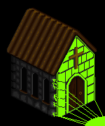
My next point is about lightsource!
 The green arrow is my approximation of the light source's direction.
It's a good one. The red arrows don't represent additional lightsources,
as they did in the previous posts, but instead just point at
troublesome spots where the shading is incongruous. I've got the roof
and the crosses - let's start with the roof.
The green arrow is my approximation of the light source's direction.
It's a good one. The red arrows don't represent additional lightsources,
as they did in the previous posts, but instead just point at
troublesome spots where the shading is incongruous. I've got the roof
and the crosses - let's start with the roof.
The roof's trouble, from a lightsource perspective, is that its side, the one facing forward, should be catching a lot of light, more than the top of it probably. It's easier to explain the shaping of this one with an image.
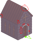
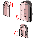
 The crosses have several problems, and what it really stems from is that
it's not that concrete what they're specific form is. By that I mean,
by the way you've shaped the pixels right now, it is unclear if the
crosses are flat, stained glass windows of the abbey, or if they're
shaped, actual crosses set into alcoves. Personally, I find the latter
more interesting. If it's like that, the recession into the wall would
interact differently with the light source. (A is flat, B is an alcove, C is a cross in an alcove)
The crosses have several problems, and what it really stems from is that
it's not that concrete what they're specific form is. By that I mean,
by the way you've shaped the pixels right now, it is unclear if the
crosses are flat, stained glass windows of the abbey, or if they're
shaped, actual crosses set into alcoves. Personally, I find the latter
more interesting. If it's like that, the recession into the wall would
interact differently with the light source. (A is flat, B is an alcove, C is a cross in an alcove)
 Other troubles with the crosses include their frames being slightly
distorted for the angle, the black outlines and crossbars swallow the
details of them a little bit, the three are all copy/paste jobs rather
than following the lightsource, and it seems odd that they would have a
brown background behind them.
Other troubles with the crosses include their frames being slightly
distorted for the angle, the black outlines and crossbars swallow the
details of them a little bit, the three are all copy/paste jobs rather
than following the lightsource, and it seems odd that they would have a
brown background behind them.
Still got two more things I want to confront. One is banding. The staircase banding of before is mostly gone, but there's still a lot of minor banding. I recommend those tutorials at the end of my previous post - they're much better at explaining banding than I am.
The other thing is texturing. This is a complicated issue. On the dark side of the abbey, I've no doubt: you have a little too much texture, it makes it look busy without adding much. Going a little easier on the texture is probably alright. On the front side it looks much more natural, maybe a bit too much texture, but not a distracting amount like on the dark side. The problem comes more from a design perspective. As you said, this is for a game. The amount of texture is kinda dependent on how you plan to use it: as a one-off asset, or if this is a recurring object that will appear multiple times in the game. If it's one-off, cool, you want it to be distinctive. However, if you plan to use it mutliple times, you ought to actually minimize the amount of unique texture. See, if you see two stone abbeys made of stone blocks, that's a regular sight, nothing suspicious. However, if you see two stone abbeys that both have distinctive and identical cracks in them, it's an unsettling deja vu, it becomes obvious that it's a copy/paste job. In an ideal world, you have a unique variation of the church for each instance you want to use it, but that's not really possible, so you need to strike a balance between making this a unique piece or a widespread representative of all monk abbeys. I leave that up to you, but thought you ought to be aware.
But seriously, it's a vastly better piece than it used to be. Now it's less about "damage control" from innate problems and more about refinement. This is definitely an admirable taking of critisism to heart and fixing things. Keep being open to advice and retain the stuff you learn and you'll just keep improving. Happy pixelling!
Ego.
I totally featured FFXIII-2 a few Sundays ago, but I've been totally diggin' this song lately, so here it is. It's by Origa, the same woman who did the Ghost In The Shell Stand Alone Complex songs (sung jointly in English, Russian, and Japanese, all by here? Impressive). But seriously, the FFXIII-2 soundtrack is great.
Hey there! I'm here today with a lesson. If you didn't know this about me, I'm a pixel artist. I've posted shamefully little pixel art on this blog, in no small part because I've more or less not made any original pieces in a while. However, I'm not absent in the scene - I've simply redirected myself. See, I consider myself decently knowledgeable about the aesthetics of pixel art. I'm no pro, and I defer to the know-how of the geniuses of the community (I'm thinking specifically of Helm, cure, jalonso, mrmo tarius, Jinn, and ptoing - there's waves more, but those are the idols who come to mind), but one thing I do that's a little different is that I'm a very thorough person, not in art, but in critique. I will write thousands upon thousands of words of critique for pieces, and my style of writing has evolved over time to try to be as clear and informative and supportive as I can be while still providing a lot of helpful information.
In the process of doing so for a bunch of people (particularly Izzy aka OCEANSCENTED - we'll see her work several times in future posts), I've covered quite the wide range of topics. From pillow shading to black outlines to color glare and saturation balance to refined lines, I've thought about quite the variety of concepts in pixel art and talked about many of them. For someone without really any formal training in art, just (at this point) 8 years of pixel art experience, I think I've gotten pretty good.
Why share with you guys though? Because a) I work hard on these but neither dA nor PJ have great ways to find past comments so I lose some of the old lessons I did, and I can immortalize them here, and b) turns out you don't need to be the target of a critique to learn stuff! I honestly think they're pretty informative even
Let's real quick take a look at my history. If I'm to talk at length in a teaching capacity, I feel it important to establish my ow credentials. I've been actively making pixel art since early 2005. I got into the hobby through the long-dead Nsider forums (the official Nintendo forums back in the day), participating in a Fire Emblem sprite thread. I began as many did, with recolors and later edits (though I must say I'm now of the mind that starting with recolors or edits are a poor way to start out). In the course of that, I joined a Zelda forum The Forest Haven (also now defunct) where I became a regular pixel art poster. Soon after, I began my custom sprite work, working from 100% scratch. It didn't take long after that for me to leave edits behind and stick solely to custom work (sort of! You'll see what I mean...), and I joined the forum attached to The Spriter's Resource, Pixeltendo (also now defunct). That was a juggernaut of a forum - everyone was a huge asshole to newbies, but through lurking and dedication I was able to really develop. I majorly credit SmithyGCN, Shawn, 1up, OMGFossil, Badassbill, and Tonberry2k for being the pixel artist I am today. I began giving serious constructive criticism posts, and through those rare times when I'd actually post, I stacked up a little bit of reputation there for that (showing up at tSRC years later, that's what I was mostly remembered for).
Eventually I found Pixelation and Pixeljoint, and joined deviantArt. While dA has a shitty support structure for Pixel Artists and is dominated by amateurs and dollers, I'm still occasionally active there, helping people out (mostly Izzy I guess). I'm most active on PixelJoint, where I go by Ego, and you can find me there quite easily, and I've received a moderator commendation for constructive criticism excellence (thanks jal!). I'm not active on Pixelation. On the whole, Pixelation has more than enough champions, and is the only major community that I consider to still be way out of my league.
So that's me! In the past while I've started making explanatory pictures to try and add a visual element to my walls of text. They won't always be there, but the most recent ones I've done will have some.
Enough of an intro though, let's begin!
iosoftware's "Monk Abbey"
Major Themes: Pillow Shading, Banding, Shape, Lightsource
So, this is actually my most recent one, and I'm starting with it for a couple reasons. First, it's fresh in my mind. Second, it's frequently illustrated. Third, it confronts probably the most important three concepts for a brand new pixel artists to understand, plus another that's vital but a bit more advanced to understand and recognize. Shape and lightsource are vital to producing an image that has a sensible composition, and are important to all artistic mediums, not just pixel art. Pillow shading isn't unique to pixel art, but it's more significant and noticeable here than anywhere else. Banding is a bit harder to explain, and is the most forgivable to mess up of these four, but is highly unpleasant as an aesthetic and is often the mark of an amateur - it's also among the least known of the major problems since it sounds like a good way of blending and can be the result of overzealous anti-aliasing rather than an active decision, and the resulting image is less hideous and more unnerving / unnatural. The other reason I pick this one first is because he did a really strong follow-up using my criticism, so it's also a pretty good example of taking and using critique well.
iosoftware is a dude from Bulgaria who put some pieces up on PixelJoint. To be frank, in general, they're not great. There's a lot wrong with most of his stuff, but this piece in particular I caught while it was in the New Pieces box on the front page and it looked rough in some key areas that I thought I could help im fix.
Basically I'm just gonna transcribe things. It was written directly to him so sometimes I'll interject a little extra commentary to generalize, but I stayed pretty widely focused.
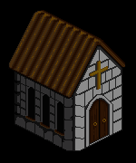
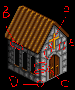
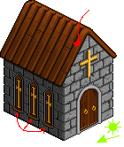
Here's the original image of his! Most of the images won't have a zoomed version as well, that's my doing and I hadn't done it before on the images.
"Monk Abbey construction from Palm Kingdoms. This one is part of the 4X size sprite set." - iosoftware's Artist's CommentsThis has some good idea behind it, but it's struck by a pair of major pixel art maladies: Pillow shading, and banding. Based on your previous uploads, this is a chronic problem for you, so I'll go into a bit of detail describing what these are and why you shouldn't do them. I'll try to keep this well-explained and break up the wall of text with pictures in links, but this could be kinda long. I'm not picking on you - you've now had several pieces rejected from the gallery for various reasons, so you didn't seem to quite understand some specific ideas, so I'm trying to explain them. Believe me, it looks like a ton, but it's more from me being thorough rather than really mean.
That's basically my disclaimer, especially if I plan on really ragging on them. The purpose really is to be constructive, but I know posts like these can be intimidating.Pillow Shading: Pillow shading is the practice of shading an object as if the light source is directly in front of an object. It's most heinous when used in the manner here - when you shade every individual object as if the light source was right in front of it, rather than placed in a single location that affects the piece as a whole. Here's a picture illustrating what I mean:
The other aspect of the problem of pillow shading here, is the shape of a block. Let me pose to you a really obvious rhetorical question: what shape is a brick? It's a rectangular prism, right? Flat sides? Yeah, of course. The problem with that is that that's not what you drew. See, you have each block having this round-ish highlight in the middle and a shadow in a ring around the edge. This is the hallmark of a round shape, of a sphere. Here's an image:
Now, that's a really obvious concept. I can't imagine you didn't understand that blocks are flat and that light comes from one place. So why did you shade like you did? My guess: that last image? Borrring! It's flat and without texture and interest. I entirely agree with that. However, in adding that shading, you changed the shape of things, and that's not good. See, texture should conform to the object, not change it. That can be hard to do with flat surfaces without leaving them boring. Let's see if we can't come up with some ideas to spice things up.
Instead, think about the shape. A good way to make it work can be to round off the sharp corners a bit - make it seem like things don't fit together seamlessly. Another is the push out the center a bit. This is done by giving the block visible edges, in that some bits along light-touched sides will get highlights while the opposite ones will be in shadow. This is hard to explain, so here's an image:
The roof is pillow shaded as well, up to a point. First off, it's not precisely clear what it's supposed to look like. From my looking at it, it appears like corrugated metal - not that bad, considering people actually make roofs out of that, although I don't think monk abbeys get that sort of roof. There's no real shaping to anything. To be brutally honest, it looks like a bunch of tubes with the light source positioned directly in front of each of them. It also hurts that they don't have any 3d sculpting to them - there's no clear differentiation between the side and the top, which there would be on the closest one, and we should see some kind of bottom side as well. While the light source is stronger the further to the bottom right you get, each of them has the exact same amounts of shadow all the time in the same places. I'm pretty sure you copy/pasted them and then added the highlights on top of that.
Uniformity, Banding: The next lesson here is about uniformity and banding. Banding is a sneaky problem that emerges when you have lines or clusters of pixels "hug" each other to try and create shading. Really though, it gives this blurry, unsettling appearance - the technical terminology is that it lowers the resolution since you can use it to easily identify the size of a single pixel, but that's a whole complicated subject. Basically, the idea is "don't do it." The most common occurrence is when you shade by tracing around the inside edge of something. Your piece is FULL of it. Let's point out some of the examples, though I'm going to ignore the BIG one for a moment.
In each of those loops you will find examples of shades hugging other lines exactly. That's not all of it though - your piece is positively covered in banding. However, like I said, I'm ignoring the big one.
The Roof:
This is a solid block of banding. Single, identical lines of slightly different color, one after the other, "recreating" a blurry gradient effect without modeling anything real. Repeating and mirroring just made it worse. It's a highly aesthetically unappealing technique, and should be avoided at all costs. The best I can say for the roof right now, really, is redo it. Redraw it entirely, keeping in mind the ideas of shape and lightsource. There's a lot of problems with the piece, but the roof is the only thing I think is completely unsalvageable in its current state.
This is my least favorite thing to say ever. Without a doubt. I utterly hate to say "scrap it, retry," it feels like a failure on my part as a commenter, it's a way out of actually explaining how to fix something. However, in this case it needs basically a complete overhaul - it's one long oscillating staircase banding which really just will not do. Just know that when I say things like that, I really don't mean it maliciously, cuz I really hate having to go there.But I said this one was about uniformity as well. See, that's a trouble with banding - it's too repetitive and "the same," you need some differentiation and variation to keep things interesting and visually pleasing. At the same time, shape demands some degree of uniformity. Here's some spots where you break uniformity in a bad way, with labeled points:
B: The size of the blocks doesn't line up. Did the builders just haphazardly decide that some blocks would be short and others long? They should be the same, or at least have some reason to why the size shifts.
C: Two things. First, the angle of the block seams don't make sense for the plane they're on. On the front, while most blocks have a "/" direction, the blocks next to the corner have seam slopes like this: "\". There's no reason for that. Second, technically, these two that I'm indicating are the same block. Right? They're cornerstones. Their seams should meet, and the slopes should flip at the corner. Which brings me to my next point:
D: There IS no corner. This building has a corner line most of the way down, is shaded like a corner, has at least two other ground-touching sharp corners, but this corner at point D is at a different angle. It doesn't really make any sense at all. Think about how it would function, maybe look at some other isometric houses to understand what it would look like. Heck, the house, ultimately, is a block with a triangular prism on top and a couple window/door holes carved out of it - just look at my blocks above and see how they show their corners.
E: Uniformity in shading. The shading should be rational and sensible, following the lightsource, but this one seems to just be gibberish - you put a banding shadow around the seams and tossed in a center highlight. Most of them are like this, I'm just only calling you on one.
Uniformity can be hard, but having a unified-looking image where everything plays by the same lightsource(s), shapes make logical sense, and objects act as they should, go a long way to making a strong piece. Remember that too much uniformity can be boring though, that making things uniform through banding is actually problematic, and that being uniform in shape still demands adherence to your lightsource.
Almost done. I got one more thing to talk about: colors. First off, I have no idea where you're getting 24 colors from - technically, you have 59 colors in there. A lot of those are clones though, goof colors that are usually an indication that you've either a) been messing with transparency, b) been using automatic tools like blur or an anti-aliased brush, or c) you saved it in a bad format at some point (it's not that one, unless you did some extreme clean-up work). I'm guessing it's the first one - you've done transparency stuff before (your Golem Foundry piece has 143 colors from it). Here's your color goofs:
The real tragedy though is that you don't even need those 15 colors. I think this could be pulled off without too much trouble using, I dunno, 8? Maybe 9? Here's it in a hyper-simple form with 6 colors where I just consolidated similar colors.
There. I'm done for now. I hope you take some good out of this - you
have the ability to pull this stuff off, you just need to keep in mind
the ideas of pleasing pixel-art techniques (avoiding pillow-shading,
banding). Almost everything about this piece comes down to a fundamntal
misunderstanding of how to use light source and shape in pixel art, and
those are your two most vital allies, far above "specific pixel
technique."
For additional reading, the best two tutorials I've seen out there:
The Pixeljoint Tutorial (http://www.pixeljoint.com/forum/forum_posts.asp?TID=11299)
The Pixelation Tutorial (http://www.pixel.schlet.net/)
Cheers, happy pixelling!
Two notes. A) Those are some hot-as-hell tutorials I just linked. Cure's Pixeljoint tutorial is a bit easier to swallow for the starter, but the Pixelation one is gorgeous and incredibly informative - the braindump thread on the main Pixelation forum that Helm used to bounce ideas around while writing the tutorial can be even better as you see it in all sorts of phrasings and ideas from people. B) This was, obviously the end of the original burst of posts. Over the next little bit, iosoftware went back and completely overhauled the entire piece and fixed, like, 80% of the things I brought up.
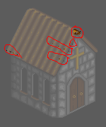
Damn better. I did a second round of crits as well that I'll include here. Major themes: Color count, lightsource, texture.Took me a bit to get here and say it (this is the second time I'm writing this post, crash ate the first round), but holy crap. That is So. Much. Better. Seriously, leaps and bounds. You've generally eradicated the pillow shading, the lightsource helps it look tight and uniform (for the most part - more on that in a second), and on the whole it's just a far sharper image.
That said, it isn't perfect. None of the things I have to say today are on anywhere near the scale of the issues in the previous post - if I saw that image in an indie game, I would be all right with seeing it. Still, some things could use some fixing, so if you don't mind me rambling on a little longer, I'd like to address them. Unfortunately, this barely tipped over the character limit, so it's in two posts.
Side Note: If I saw it in a major triple-A title I'd be ecstatic, because the decline of major use of pixel art in favor of the "superior" 3D models (which are not inherently better) is fuckin' tragic. This was Ego talks art in game development, now back to the lesson.First: color count. You, once again, have some one-off colors that shouldn't be there. I mapped 'em out for you again.
It's strange - duplicate colors aren't uncommon, but lately I've come across several pieces that seem to have this same sort of symptom. I think it has something to do with a recent Photoshop alteration about opacity on brushes dropping on its own sometimes.
My next point is about lightsource!
The roof's trouble, from a lightsource perspective, is that its side, the one facing forward, should be catching a lot of light, more than the top of it probably. It's easier to explain the shaping of this one with an image.
Still got two more things I want to confront. One is banding. The staircase banding of before is mostly gone, but there's still a lot of minor banding. I recommend those tutorials at the end of my previous post - they're much better at explaining banding than I am.
The other thing is texturing. This is a complicated issue. On the dark side of the abbey, I've no doubt: you have a little too much texture, it makes it look busy without adding much. Going a little easier on the texture is probably alright. On the front side it looks much more natural, maybe a bit too much texture, but not a distracting amount like on the dark side. The problem comes more from a design perspective. As you said, this is for a game. The amount of texture is kinda dependent on how you plan to use it: as a one-off asset, or if this is a recurring object that will appear multiple times in the game. If it's one-off, cool, you want it to be distinctive. However, if you plan to use it mutliple times, you ought to actually minimize the amount of unique texture. See, if you see two stone abbeys made of stone blocks, that's a regular sight, nothing suspicious. However, if you see two stone abbeys that both have distinctive and identical cracks in them, it's an unsettling deja vu, it becomes obvious that it's a copy/paste job. In an ideal world, you have a unique variation of the church for each instance you want to use it, but that's not really possible, so you need to strike a balance between making this a unique piece or a widespread representative of all monk abbeys. I leave that up to you, but thought you ought to be aware.
But seriously, it's a vastly better piece than it used to be. Now it's less about "damage control" from innate problems and more about refinement. This is definitely an admirable taking of critisism to heart and fixing things. Keep being open to advice and retain the stuff you learn and you'll just keep improving. Happy pixelling!
End Recording,
And that's all I got! This is kind of a behemoth of a post by now, so I'm just gonna shut up and post this. I hope you've enjoyed it and maybe learned something about pixelling! If there's something you'd like to learn about, I could do a post about that, and if you've got piece that you'd like some help with I love to do that as well. Otherwise I'll probably put up another thing in a couple days - maybe a week or something. I'll try to get omething else up before next Sunday as well, sorry for the general inactivity lately. Later!
Ego.
No comments :
Post a Comment