http://www.youtube.com/watch?v=dp9X7bChcPs&feature=player_embedded
I finished Ghost In The Shell Stand Alone Complex the other day. It was freakin' awesome. This song, the ending to season 2, is just amazing. I recommend the series completely, it's some of the best sci-fi out there.
Jiinchu is a newcomer to Pixeljoint. He's Brazilian, and doesn't speak any English. And I've been working to help him as much as I can.
Unfortunately, there's that language barrier in the way. See, if you hadn't noticed by now, pixel art uses quite a bit of jargon. We talk about banding and anti-aliasing and dithering and pillow shading, not to mention the idioms I tend to use in my own speech. Metaphors and common phrases cease to be helpful, and this all assumes that Google Translate manages to catch even my basic English. As such, after my first post I scaled back my language to more translatable messages and started using a lot of illustrations. Seriously, two dozen pictures at least. In the end, I give maybe three complete approaches to understanding banding, and I think it's the best explanations of banding I've ever given.
Without further ado, let's begin.

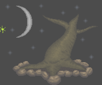
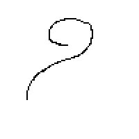
This is the original. See how many things you can notice before moving on! (there's a lot to notice...)

His response:
Me again:
So learn realism, and then start breaking things. That's why it bugs me when people jump right into manga-style and stuff - the work is inevitably flawed in areas like anatomy when they begin doing their own work. Learn to draw in a manga style and you've locked yourself into one way of doing things; learn the rules of the world, and you can experiment infinitely.
For an example of style out of realism from my own work, I'm hugely fond of very clean, perfect curves. This limits me a bit in dealing with certain angles as I find them hard to smooth out. Uneven pixel formations bug the hell out of me in my own work. I know it's a bit limiting and that real life often involves imperfect curves, but I just don't like 'em. Check out my vector work especially, the little imperfections in the curves drive me nuts.
Jiinchu:


 Still getting a bit better. He's gotten the AA stuff down a bit better, and the moon is pretty nice, but he's got the banding still, and even now I can say he's still working on the color count thing. I took another round.
 I'm pretty fond of it.
Responses:


He answered with thanks but didn't post a revision to the piece. He posted what is effectively a sequel piece, but I'm not gonna talk about that one here until I'm sure he's not gonna do any more editing. Besides, this post is gargantuan. Later folks, hope you get some real benefit out of this.
End Recording,
Ego.
I finished Ghost In The Shell Stand Alone Complex the other day. It was freakin' awesome. This song, the ending to season 2, is just amazing. I recommend the series completely, it's some of the best sci-fi out there.
Jiinchu is a newcomer to Pixeljoint. He's Brazilian, and doesn't speak any English. And I've been working to help him as much as I can.
Unfortunately, there's that language barrier in the way. See, if you hadn't noticed by now, pixel art uses quite a bit of jargon. We talk about banding and anti-aliasing and dithering and pillow shading, not to mention the idioms I tend to use in my own speech. Metaphors and common phrases cease to be helpful, and this all assumes that Google Translate manages to catch even my basic English. As such, after my first post I scaled back my language to more translatable messages and started using a lot of illustrations. Seriously, two dozen pictures at least. In the end, I give maybe three complete approaches to understanding banding, and I think it's the best explanations of banding I've ever given.
Without further ado, let's begin.
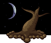
Jiinchu's "Darkness"
Major Themes: Banding, Anti-Aliasing, Pillow Shading, Lightsource.
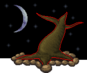
This is the original. See how many things you can notice before moving on! (there's a lot to notice...)
What did I notice?
You misinterpreted - pillow shading is a critique.
This piece has the concept in the right place, but the pixel execution has a lot of problems. The primary two problems are pillow shading and banding.
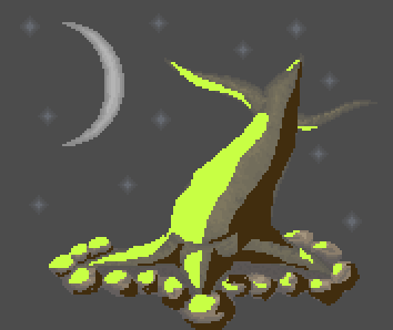
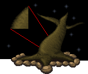
Pillow shading, if you're not aware, is the practice of shading each individual object as if the viewer themself is the light source (in this case it's actually slightly above the viewer). It's a very common problem among those new to pixel art. It's a problem because a) it facilitates banding (your second issue, I'll get to that in a second), and b) it causes your image to lose depth. The problem is that looks like every individual object has its very own lightsource right in front of it; the rocks each have their own, the tree has its own, the moon has its own, etc. Because of that, they don't appear unified, and are each lit approximately the same amount. Comprehending the idea of placing a light source (and sticking to it) is one of the most important steps to realizing shape. Here, I've illustrated real quick.
Step 1: I grayed out your image so my highlighting is visible - that's just for this example. I then added the place where I was going to make the primary lightsource - I placed it slightly from the front and significantly to the left. You don't always place the lightsource so close to the actual piece, but that's how I need it to illustrate well.
Step 2: I mapped out "How would the light rays hit things?" This is a planning step.
Step 3: I block out the highlights and shadows of things based on the light ray trajectories I planned out. For reference, all this is drawn free-hand - none of the pixel lines are smoothed or precise. You can already see the difference from your piece in that you can concretely see the three-dimensional shape of the tree.
Step 4: I don't mean to imply that you can only have one light source though - let's add a second one to make the piece even more dynamically lit. Let's make the moonlight hit the piece! I'm not gonna map trajectory this time, but think that even though it's on the left, it's actually behind and very far away (as a side note, that moon is very large compared to the tree). The rocks overshadowed by the tree get NONE of this light. This one is just to see how that lightsource would work alone...
Step 5: And now let's put the two lightsources together! The lit up parts overlap - the shadows of one can't override highlights of the other.
How's that look? You can see the shape, and more specifically the DEPTH - some parts look absolutely further away than others. Do you see my point?Too bad that link doesn't help in this case with the language barrier in the way, but if it had been good for him I wouldn't have written my later spiel.
Let's hit my couple other quick points about lightsource before I move to Banding. The moon: the moon shouldn't really have any shadows at all. Think about it - nothing is casting a shadow on the moon other than the earth itself, which is what causes the cresent. The moon isn't perfectly smooth, but from so far away it's effectively neutral. Any shading on the moon should be used to represent the vast mountainous ranges or craters or sunken areas that we can actually see - essentially, take a look at some photos of the moon.
Alright, I'm bad at explaining banding. It's basically when you have curves of pixels that are exactly hugging each other without variation in the shape of the clusters. It creates a weird pseudo-gradient effect that makes the lines almost "blurry" and indistinct. Your outline on the tree which is a perfect hugging line is like that, as is the shading on the moon. This is a common symptom of pillow shading, where shadows move out radially and in a steady gradation. I'm just going to refer you to the amazing Pixelation tutorial on banding, it does a much better explanation job than I am here. http://www.pixel.schlet.net/#C2
Neither of these things (lightsource, banding) are things to be ashamed of doing. It's common. Especially banding, probably because it's hard to explain. Still, they don't look all that good, and if you can train yourself to find these things, then your work will improve. And once you understand a lightsource and all of this, THEN you start looking to texturing - cracks and bumps and ridges and divets. I hope some of this helps - I know it's an awful large post, but I mean it in the most helpful way. Good luck, hoping to see more from you in the future! :)
His response:
Wow, I really can not imagine how complex a simple paisagem.Vou I was sure that I must now produce the maximum realism in my art, thanks for the great tip :thumbsup:.I confess, I hadn't thought about the language thing on my first reading. I thought this was sarcasm - it's not the first time I've had one of my rather-extensive posts come off as arrogant and know-it-all, so I'm a touch sensitive toward that (as a side note, that's actually where my handle Ego comes from!).
Me again:
Well, you don't need maximum realism. That's jumping the gun a bit. Something can remain stylized and unique and "unrealistic" without falling into these traps. Almost everything, save literal abstract art, uses lightsource. Anime uses it. Video games use it (The Legend of Zelda The Wind Waker is hyper-stylized and uses lightsource extensively, and even old games for the Game Boy and stuff used them). They've been in use since humans managed to use multiple shades of the same color to imply light and darkness. All this to say that you can HAVE a stylized piece while sticking to the rules of reality, like how light works. Pillow shading though is a specifically pixel-art issue, and is more to do with aesthetic than realism - it just so happens that the bad-looking pillow shading usually results from poor lightsourcing. Banding is an entirely pixel aesthetic unrelated to realism.It might sound a bit self-serving, but I think this is a great point that's worth understanding. I preach a lot of obeying the standards of reality, and I think that drives toward the idea that I rank realism over style. I don't - I really don't. Style and panache is far more important than just representing things just as they are. While that's a good test of ability, it lacks for some imagination, though particular visions of reality can easily be worth presenting. But for me, learning the trappings of how things are in reality is simply a stepping stone, giving me a grounding in reality so I can deliberately break the rules in constructing pieces. And it has to be deliberate, consciously done with thought given to the impact of the decision upon the piece.
And I'm a fan of non-realism when done deliberately. But, as the saying goes, you need to understand the rules before you can break 'em. And seeing your piece history here so far, I think that putting some more thought into these things could really help that.
And it's not as complex as it looks - I'm just wordy. The main thing to just keep in mind the way light works, and to watch for banding. There's no tricks to banding that I've found, that one's just building up pixel technique over time. Good luck, and I hope it really does help you some!
So learn realism, and then start breaking things. That's why it bugs me when people jump right into manga-style and stuff - the work is inevitably flawed in areas like anatomy when they begin doing their own work. Learn to draw in a manga style and you've locked yourself into one way of doing things; learn the rules of the world, and you can experiment infinitely.
For an example of style out of realism from my own work, I'm hugely fond of very clean, perfect curves. This limits me a bit in dealing with certain angles as I find them hard to smooth out. Uneven pixel formations bug the hell out of me in my own work. I know it's a bit limiting and that real life often involves imperfect curves, but I just don't like 'em. Check out my vector work especially, the little imperfections in the curves drive me nuts.
Jiinchu:
Again help me. Their tips are great, but I struggle to understand some parts, I'm Brazilian. Remake this I will work, and what do we see bring forth xDMe:
Sure thing, I'll help as much as I can, and try to use pictures to show what I mean rather than just telling. Just try to follow as much as you can, and I can help further on things that didn't make sense. :)Jiinchu:
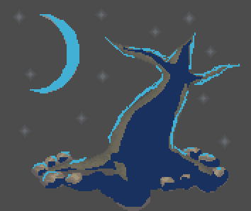
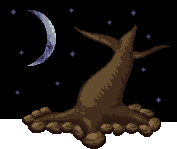
I made a new version of this work, with pillow shading correct, check if it goes '-'
This is totally way better. There's another comment but it's only in Portuguese, and I re-cover the idea he talks about anyway.
Me:
Yes! For the record, you didn't insert pillow shading, you removed it. But yes, it looks noticeably better!
That doesn't mean we're done though. We've fixed the pillow shading issue to a pretty good degree, things follow a consistent lightsource now. The moon also looks better. The banding is still an issue though, and that, along with the colors (pukahuna is right and I'm gonna talk about that), is the topic of the moment.
I'll take another shot at banding since I don't feel I did it justice earlier. Banding is the name given to a pixel scenario where a line (or curve) of pixels directly hugs another one. The intention of it is usually to attempt to smooth the transition between two color. One problem: banding looks really bad. Instead, we have a technique called anti-aliasing that performs the same function (smoothing out a color transition) without the problem of looking really bad, unless overdone of course (since pretty much anything looks bad when overdone).
Here, I'll use some pictures to explain anti-aliasing and banding.
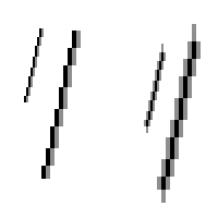
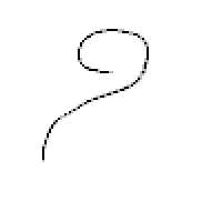
1. I drew a squiggle freehand.
2. I cleaned it up into a single one pixel wide line. This will be the base on which I'm explaining.
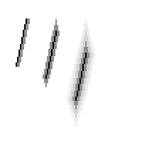
3. THIS is banding. They're both one pixel of banding as "shading" to transition between white and black. The one on the left is one-sided, the one on the right is completely covered.
4. The one that was on the left, the one-sided banding, applied to the squiggle. Not looking quite right.
5. Now it definitely doesn't look right. This is the full surrounding banding. This is still just one pixel on either side of every black pixel. See how it forms distinct bands of black and grey? Those bands are where the word banding comes from.
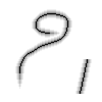
6. This is what we call staircase banding. It is pretty much the worst. Multiple successive bands of progressively lighter colors.
7. We've applied the staircase banding to the squiggle. It now looks almost nothing like the original squiggle and the bands are forming an indistinct blurring effect. It doesn't look good at all, and it was actually upsetting to draw it for this example. Thankfully, I very rarely see people actually do this to this sort of degree. This is just about the lowest point of banding.
Think about what the banding in these scenarios is really doing: it's altering the shape of the squiggle. It no longer has the same shape - it's thicker and the precise curves have been broken down. The technique you're using to try and soften a particular shape has made it into a different shape instead. Plus it just doesn't look good.
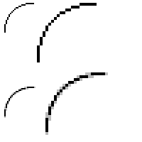
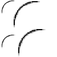
8. Let us switch tracks for moment now. We've discussed banding as bad, but what's the alternative. As I mentioned, anti-aliasing. Anti-aliasing is a technique where you put a transition color only at the corners of the original line, rather than along the entire line in a consistent manner. I've drawn a quarter-circle (on top) and given a single color of anti-aliasing.
See how the shape didn't change? It made the transition less harsh while preserving form.
9. I've applied that single color of anti-aliasing to the original clean squiggle.
That's appealing and simple!
10. However, there is such a thing as too much anti-aliasing. This is the same quarter-circle, but with two and three colors of anti-aliasing. They start intruding upon the shape, and the three-color one is actually starting to band a little bit.
11. A second color of anti-aliasing on the squiggle.
12. And a third!
This is still much nicer than any of the banding pieces, but it's not as clean, smooth, and simple as the one-color anti-aliasing.
13. This is just a clarifications, but you can band with more than one-pixel-width lines. These are just as bad, if not worse.
But how to apply this? Your piece isn't made of single-pixel lines, after all. The key is to use anti-aliasing at harsh transitions and jagged curves. Let's do an example with your piece: the moon.
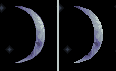
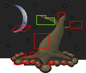
This is an image of your moon - the original is on the right. You can see have the edges are pretty rough, even though the shape is right. The cresent is good, but for some reason it isn't quite smooth. That's because of the bright colors on the black background making the pixel changes at the corners very obvious. On the left, I've anti-aliased your moon. Even though bright colors are touching dark ones, because I've provided a transition color at the exact corners where the jaggedness appeared, it looks a lot smoother.Where else can we see banding show up where anti-aliasing would be prefered? I've pointed out a couple.
1. First, basically the whole tree is ringed in a band of the dark. It's vaguely like an outline, but is so close to the black in color that it just bands onto the other colors, not to mention that an outline would be weird considering the style of the rest of the piece.
2. This area on the trunk is positively covered in an excessive amount of banding and overzealous anti-aliasing.
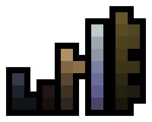
3. Almost all the rocks have some degree of banding to them.That should be enough about banding and anti-aliasing to get you going! Next, color.Color is a hard subject. On the one hand, you haven't done anything WRONG with the colors. On the other hand though, these are definitely not your optimal colors. There are three things to consider about color here: conservation, contrast, and consistency. Let's hit them each real quick.For easy reference, this is your palette, organized together. If two colors are precisely side-by-side, it means I think they're so similar that they're practically undistinguishable.
Conservation: This is the practice of using as few colors as necessary to achieve the desired appearance. You have 32 colors plus transparency (which we count as a color), many of which are very similar to each other. Oddly, you use a lot of shades on the tree, but chose to only use a couple shades on the rocks. I'll get to that.
Contrast: This is how different each individual shade is from its neighbors. You tend to use low contrast - the tree has absurdly low contrast, the soil and stars have negligible contrast. The moon and rocks have fairly moderate levels of contrast - I'm quite fond of the moon's colors. Typically, the lower the contrast, the more colors you need to use to display shading. The tree could use some more contrast.
Consistency: This is what is hurting the piece. As Pukahuna is saying, the tree is fairly dark compared to the rocks, it doesn't pick up as much light, which is weird. In theory, the light should make the tree about as bright as the rocks, although a different color. Really, this is a matter of experimentation, just working it til it works right. Trying to get similar levels of contrast through a piece gives it a unified look, and doing so will keep your color count sane.
On color choice: There's a lot of brown in this piece. That's not bad, but it IS a lot of brown. I like the moon's colors though, they're nice.
That's pretty intense. He followed through cheerfully with an edit!That's probably enough rambling from me. Let me know if something translates poorly and I'll take another stab. Have fun revising, and seriously, this version looks way better than the original, nice job.
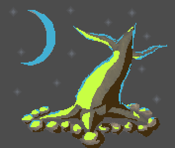
Very neat. I can see two area where most of the changes happened, in the moon edges and the rock colors. I would still take a look at what I said about banding last time, as the tree itself has many issues still, but the other parts are improved.
The moon is definitely a lot smoother, wouldn't you agree? I certainly think so. An additional thing to look at with the moon would be the bottom tip. It doesn't taper to a point the way the top tip does, which makes it odd not symmetrical.
Another thing about the moon is that you only ADDED anti-aliasing to the corners. In general it looks good, but it slightly deforms some curves; try experimenting with cutting into the existing bits instead if adding more makes the curve warp. This is fairly intuition-based, you'll get better at (and feel more confident about) trying to refine using anti-aliasing if you keep practicing.
As for the rocks, I would say that the colors are much better in that they feel in line with the image now. I still think the sheer number of colors on the tree and the "smooth" appearance that gives it makes it look a bit odd next to the rocks, but just talking about the actual shades, they fit much better.
Really, you just need to get to work on clearing out the banding. As you go through it, you'll find that you need to round out a few curves.
And because I feel bad weird about a critique post with no pictures, I did an edit of your piece to show you some of what I would do. Not everything I do here is necessary, much of it is based on my own personal preference, but it should be a good example of the potential in the piece.
1. First I would reduce the color count. Your piece has 39 plus transparency colors in it, which is far, far beyond what I need or want for myself. I select similar regions of tree color and fuse them together, then make the rocks and the tree the same brown. I do the same grouping procedure on the moon and the stars. The moon colors also got a slight increase in contrast. I did no alterations of the actual shape of anything. I got it down to 11 plus transparency colors.
2. I then went to work on refining the pixels. The moon got some very careful changes, and I tried to alleviate the banding when I went to work on the tree. I only got through the left side, top tip, and left branch, though I could continue. I made pretty regular use of a technique called dithering, which is a sot of checkerboard pattern meant to trick the eye into thinking it's seeing an intermediary color. No need to rush into trying that one out; you should master the idea of anti-aliasing and removing banding first. I also did something I've been meaning to mention, I changed the stars. The stars were very large for the scale of the piece, and real stars don't quite glow like that. The glow was causing some major banding on its own, so I dropped the stars to be much more simplistic.
I've done a little more as well.
I could continue and do the rest of the piece, but I'm more interested in seeing what you do next. Get to work on the banding, I know you can clean it all up!
Responses:
I do not know what to do. Place dithering at all? :XMe:
No need for that. I mean, if you'd like to experiment with that, go ahead, but it's not necessary. The most important thing is removing the banding from the piece, probably by replacing it with careful anti-aliasing.
So before I go off in the wrong direction and re-explain something, what exactly are you having trouble understanding? Do you understand what I mean when I say banding after the explanation before? Did you understand my explanation of anti-aliasing? Do you understand the words but don't know how to find the banding inside your actual piece? Or can you find it but don't know how to actually change it?
You answer should help me to figure out how to help you.Jiinchu:
There is a difficulty in the language. From most to least understand the word "banding", in which case it means "bandas", what really makes no sense to it. I can refine the trunk? Adding colors?And me, pretty intense post again. This is my best explanation of banding I think.
Excellent, I can help with that! Unfortunately banding is simply jargon so we doesn't have other words that mean the same thing, but I can explain what I mean when I say the word.
The word I use, "banding," is a term we use to refer to a certain configuration of pixels in pixel art. When you have a row of pixels, we just call that a line. But if you take two lines of exactly the same shape and slightly different colors and put them right up next to each other, this is what we call a band. Here's a picture, take them into your art program and zoom in so you can see what I'm talking about on a single-pixel scale.
*
This is a one-pixel line. There is nothing wrong with it.
*
This is a band. See how the lines, which are the exact same but one is gray and one is black, are right next to each other? This is bad. When zoomed out, it makes the line look somewhat blurry and ugly. This is the important thing to understand: when I say Banding, this situation of two similar but differently colored lines or curves right next to each other like this. Whenever I say banding, think about this blurry appearance.
*
This can happen in layers as well. The more bands on a line the worse it looks.
*
Banding doesn't only happen on staight lines. In this curve, you can see that instead of each identical (but different colored) curve is lined up with the others. When zoomed out, this looks very bad for several reasons, but the most important is that it looks blurry and jagged. The shape of the line is not clear, and it is not smooth. But what do you do instead?
* With the straight line, you do nothing. It doesn't need transition colors at all! Even if your banding is just two different images near each other, try to avoid making that pattern of identical lines next to each other.
*
If we just leave the curve alone, it looks okay, but not great. We want to make it smoother, but how do we do that without banding?
*
The answer is anti-aliasing! The technique you used on the moon to make it smoother by putting an in-between color at the corners is the key to smoothing out imperfect lines without banding.
That is a very textbook definition of banding. (heh, I wish they made pixel art textbooks...) That general pattern is the important thing to learn to notice in your art, and then you revise the piece to have different things such as anti-aliasing instead of banding. Now, I'll point out some things about your piece in particular.
*
This is your image with some marks by me. Most of your colors have been made much more grey so my marks can stand out - that is not a thing you need to do. You can see that I have put red boxes and green boxes. Inside the red boxes are areas where I think you have banding. The parts I think have some banding have been left their original color, so they look darker. The green box is actually something I think you did well, so I'll talk about that first.
*
In this green box, I think you did it correctly. Instead of the shading being the same shape as the line, you've placed it only in the corners in an attempt to use anti-aliasing. It is not the most sophisticated anti-aliasing job, but it is a noticeable and strong attempt! With practice, you will discover how to make your anti-aliasing look even better - once you have the theory down, it's just a lot of practice and experimentation to find what looks good.
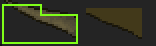
*
This is an example of one of the red boxes, right from the middle of the trunk. When I just show the curve and the banding (the section in the middle), do you notice the way the in-between color almost perfectly sticks to the outline? That is what I said was the banding pattern, correct? It makes it looks somewhat blurry and jagged. On the right, I have given a demonstration of how I would fix it, by placing the shade only in the corners. You should also notice that I did not do anti-aliasing on the 45-degree angle. This is also what I am pointing out with the red boxes on the moon. 45-degree angles are like perfect horizontal and vertical lines in that you don't need to anti-alias them. There are things you can do to smooth them out still (such as tapering my anti-aliasing as I approach it) but that's getting into more advanced use. For now, just understand that you place shades just in the corners to smooth out a line rather all along it, and that 45-degree angles don't need as much anti-aliasing.
So that should be a fairly decent explanation of what banding is and how to solve it. All those other red boxes I made have their own examples of banding; take a close look and try to find it, and then figure out how to change it into anti-aliasing instead.
As for your other questions, refining the trunk is a possibility. By removing the banding, you'll have given the trunk a much better silhouette, leaving it in a great state to texture it, though bark texture isn't quite a specialty of mine. However, you should NOT add colors. The best situation would actually involve removing some colors. Remember that in pixel art, we often try to use as few colors as possible to create the desired appearance. Your tree trunk uses many more colors than necessary. You have somewhere around 14 colors on the tree trunk, and I think you could easily only use 5 to get the same general appearance.Seriously. If you don't get banding by now, I'm not sure how to better spell it out without doing it, like, face-to-face. In fact, if you care to learn and you still don't get it from these two sets of text, the other lessons, and the Pixelation and Pixeljoint tutorials, let me know and I will try to teach you face-to-face over Skype or something.
Does this help you understand any better? If not, ask all the questions you need, but try to be as specific as possible about what you are not understanding so I can answer your precise troubles. Good luck!
He answered with thanks but didn't post a revision to the piece. He posted what is effectively a sequel piece, but I'm not gonna talk about that one here until I'm sure he's not gonna do any more editing. Besides, this post is gargantuan. Later folks, hope you get some real benefit out of this.
End Recording,
Ego.
No comments :
Post a Comment