Linkin Park is not good all the time, but I've been quite fond of this one.
Note: If you hate 'em for their reputation, yeah, you're a hipster. Open that mind.
Sorry for the delay, had to actually write this damn thing.
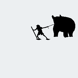
Splug's "Taming The Beast"
Major Themes: Composition, Posing, Design, Colors
No author comments, this is his first piece here.
Thursday, when I first saw the piece, I wrote this:
This is an interesting piece. You have some good intuition about the composition and structure of the piece, and those alone give it a pretty good look. However, the pixel techniques are pretty lacking, and I want to talk more in-depth about them. I don't have time right now, but I'll be back writing you some real critique sometime tomorrow. I think you have some serious potential, I can see the artistic/creative parts of you run really strong, so it's just a matter of learning the ins-and-outs of the medium.
Just wanted to leave this here to remind myself to come back. Also, I like the kinda Sword & Sworcery vibe coming off the dude.So, did you notice how it's basically that's some REALLY kid gloves I've got on there? I'm treading with a VERY light touch here for three reasons. The first is that this guy is friggin' 14 years old and I want to support an artistic kid. Second, he has no comments and no other pieces, and I really didn't want to scare him away with a giant critique without preparing him for it. Third, well, this piece has a LOT of flaws on the pixel side. I don't end up talking about them too much because a piece THIS LACKING in pixel-level technique indicates ignorance of the very existence of these techniques, so I just introduce the idea of the techniques.
Today, I finally finished writing.
Oh man, where to start? I don't mean that the piece is so full of issues (though, well, it is, but not in a way you should be ashamed of or anything, you're just still new!), but moreso I mean that this piece highlighted several major things I want to talk about. Essentially, this is a piece with a great concept and a decent composition without the slightest understanding of pixel-level technique. I want to establish right off the bat that I think you do indeed have what it takes to be pretty damn great - I don't take this sort of time for people unless I think they have real potential, so please don't be afraid of the large volume of text. Of all things, that idea stage is the hardest, and you have that already. The composition stage is part intuition and part science, and I think you have the intuition side down, and I just have some ideas that could further it. The pixel-level technique stage is both easiest and most difficult - at its core, it's just a set of specific techniques that make pixel art distinct from other art forms, but the hard part is that the only way to get these skills is through practice.I'm not lying here - the idea's the hard part. Everything else is practice.
Full disclosure: I did a COMPLETE edit of your piece. I will NOT be showing you the whole, but portions for illustrative purposes. This is to keep you from getting my image in your head and mimicking it and instead allowing your own creativity and ideas to flow better.I hope to use this sort of strategy in the future as well. This is why I teach by critique, and after seeing multiple people editing their pieces to kinda look like my edits I realized I was defeating myself.
HOWEVER, you the blog readers will see it! In a whole post featuring my overall process! That's my repayment for the lateness.
Okay, my critique of composition has 4 primary factors: creature design, posing, the environment, and color choice. Let's hit 'em one at a time.
Creature Design: The Beast here doesn't appear to be any one existing creature. When I look at it, I see a polar bear crossed with a lion, plus whatever those lines are on its face (ridges?). All in all, a cool critter. It definitely looks like a creature that has some real power behind it. My weirdnesses with the creature mostly come from the ear/mane region. The mane doesn't seem to be following along any real shapes like the neck or anything, so it appears to just form a natural point, which is a bit odd. Also, the ears are both quite large, but more importantly, they're VERY high up on the head, coming out of where we'd expect a neck. I would expect them coming out of the mane only just aboe the eyebrow ridges, slightly off to the sides.
Also, uh, based on that pose, we ought to be able to see the fourth leg, at least a little.
Posing: As it is, it looks good, but I think it could be even STRONGER. See, the beast currently looks relaxed, like it's just moving along at its own pace, being led by the man (who, incidently, reminds me of the Wayward Vagabond from Homestuck for some reason). I was looking at the piece, and with a name like Taming The Beast, I was wondering if we could get an even more aggresive feel from it, like the beast is actively struggling against him and he's really trying to haul the beast along. As it is, it looks more like "large pet" than "wild beast on a chain." Here's a "science of composition" thing: in your general shapes, straight, angular lines convey a sense of power, while smooth curves convey a softer feel. Not just in the literal lines, but in the gestures. Here, check this out:
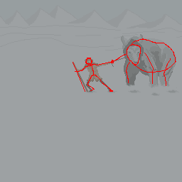
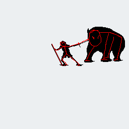
These are the silhouettes and basic gestures of your characters right now. Instead let's have the beast digging in his feet, trying to stay rooted while the man pulls him along: (image 11). Here's the silhouette of my edited version, with gesture lines:
The straighter your general motion lines, the more aggresive the pose seems (in general). By giving the characters more active poses, I tell a more concrete story of "taming the beast" with the composition even before I get to the pixel level. Try exaggerating your gestures!
The Environment: Now, I'm not precisely sure what you were going for with those background lines. My guess is that you wanted to convey the feeling of a vast barren waste that the man has to drag the beast all the way across, making the struggle seem even greater. Those background lines, well, I think they were meant to make it look like there's all those snowy hills in the back, but really they just muddy the piece. Additionally, with those snow mountains in the back, honestly it looks like you got a little lazy - the main problem is a lack of variation. It's cool to have mountains, but if they're far you should have a clear horizon line and the mountains shouldn't all look so similar to each other. Honestly though, I think the whole "barren desolation" thing could be better supported with a mostly clear horizon, maybe with a couple mountains poking out past it.
The Colors: This is a hard one to explain. Basically, my main point is that you've used a true grey and that's a bad idea. See, almost nothing in reality is true grey, everything is hinted with color. Grey has two main purposes in pixel art: a) to accentuate an object's LACK of color (often used for dramatic effect or to draw attention to the more bold or colorful objects in an image), or b) to act as a buffer between two other colors (as it is in the Commodore 64 palette). I don't want to say NEVER use grey, but in this piece, you want to infuse some sort of color into that grey, even if it's a very low saturation color. Grey pushes the eye away, and is generally just boring (not to mention the fact that contrast with grey is much stronger than with many colors). Here's an example where I through some blue into your palette:
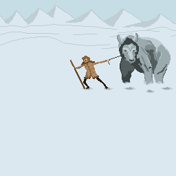
Also, your sky color is very, well, bland. It's not BAD, but it doesn't pop, it just kinda blends with your mountains, so it's not very distinct. A common thing with barren wasteland pieces is they often put a very intense sky color to balance the desaturation of the rest of the piece - check out any major desert imagery or the like and you'll see what I mean. Think about throwing a much more saturated sky in, just for some contrast!Whoops, I pawned off my whole pixel-level section to my other tutorials! I think they're worth it though - I wrote them very carefully, so wasting space reiterating is useless.
This is my design / composition critique. Next up is the pixel-level techniques.
Alright, so you're missing the most basic pair of tools in the pixel artist's arsenal: clean lines and anti-aliasing.
Clean lines are a tough thing to do at first. Oftentimes, recognizing jaggies (a piece of lingo referring to jagged lines, or unclean lines that are aesthetically unpleasing) is down to intuition, and this is something that will be trained into your eye as you do more pixel art. For my part, I'm especially sensitive to unclean lines, giving my art a lot of smooth, swooping curves. The key to a smooth line is evenness. In a straight line, it's about being consistent with the length of each little segment of the curve. With a curve, the key is to increase or decrease the segment length in only one direction. This piece's biggest issue comes from its cleanliness - the environment lines behind them, the shading curves on the beast, the general outline shapes. With curves cleaned up, it could be awesome.
I WROTE A WHOLE TUTORIAL ON CLEAN LINES IN THE PAST, I RECOMMEND READING IT
Sometimes, you can't make a line totally clean without sacrificing shape, and shape would seem to be more important. In those cases, you make the lines as clean as you can, and then use the most prevalent and most generally helpful technique that's specific to pixel art: anti-aliasing. AA is where you place an intermediate color at corners of junctions between two colors. It's a very well-documented technique, and I recommend reading some stuff about it. A simple google search should find you some decent explanations, as well as another TUTORIAL BY ME which also explains a problem called banding that you want to avoid (it commonly arises from misunderstanding AA, so watch out!). Because the piece doesn't have ANY of it, I'm gonna chalk it up to not knowing of the technique, so I won't go into depth about where you should use it so you have a shot to try for yourself.
Overall, the piece looks sketch-like. The key now is refinement. Anyway, I'll shut up now, so I hope to hear from you and maybe see a revised version of this, cuz again, you got the instinct to really make it!And that's pretty much it! He has yet to reply, and I don't know if he ever will. I hope he does though, I want to see more from him.
Oh, and here's that edit!
.png)
End Recording,
Ego.
No comments :
Post a Comment